


When you start the branding process, you typically think first about your company’s name.
Next, you design a logo. Finally, you create a motto or identity that defines who you are and what you stand for. For McDonald’s, though, the process was reversed: they began with a story, which turned into a logo.
Almost half of the population of the United States lives no more than three minutes away from a McDonald’s. The rest live within a three-minute drive from a billboard pointing to a nearby McDonald’s.
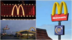
The global fast food restaurant chain, along with Coca-Cola and Nike, is one of the most recognizable American corporations. For marketing their brands, Nike needs a “just do it” slogan alongside the swoosh logo and Coca-Cola uses Santa Claus to drive sales. McDonald’s, on the other hand, needs only a rounded letter “M” and a hungry customer.
Behind that “M,” placed on a striking red background, lies the full story of the Golden Arches. It’s a story of a pragmatic attempt to be noticed, and turn a shape into a globally-recognized symbol for a restaurant.

In 1952, brothers Richard James “Dick” McDonald and Maurice James “Mac” McDonald from Manchester, New Hampshire, decided to build a new place for their small hamburger restaurant in San Bernardino, California. Not wanting to piggyback on somebody else’s idea, they intended to build something bigger, better, and truly original. The McDonald brothers had two goals in mind: designing a memorable, family-friendly place that would attract customers again and again, and developing a system that could support their innovative “fast food” concept of speedy service.

Unschooled but equipped with a lot of practical knowledge, Richard McDonald had a brilliant idea to make their restaurant stand out from all the other burger stands on a city street. Having been in the food industry for almost two decades now, he and his brother knew that nothing beats the competition like a bright, eye-catching building.
He envisioned the place as a simple burger stand, but with two arch-shaped semicircles placed on both sides. In his rough sketch of the idea, he called them “The Golden Arches.” Now with a firm concept in hand, the McDonalds only needed an architect to make their dream a reality.In 1952 the brothers looked for candidates and started to arrange interviews.
The first person they spoke to said that the arches were too much, and wanted to build the burger stand without them. The second criticized Richard’s idea as well, wanting to change it completely. The third, a prominent, yet arrogant architect named Douglas Honnold, wanted to redesign the restaurant’s entire concept altogether. Severely disrespectful to his clients, Honnold always built by his own standards and beliefs and told the McDonald brothers that interfering would mean they would have to build their stand by themselves.

With no luck yet, and patience running thin, the McDonalds finally found what they wanted with their next candidate, an architect named Stanley Clark Meston. After carefully listening to the McDonalds’ idea, Meston looked at their sketch and accepted the proposal, not knowing that he had just agreed to design the symbol of a future global corporate giant.
Helped by his assistant Charles Fish, Meston designed two 25-foot yellow sheet-metal arches decorated in neon and presented them to the brothers.
They were almost exactly as the McDonalds had envisioned them, so the brothers accepted with no hesitation whatsoever. Thus, the Golden Arches were officially born.
Meston created a sign with a third, smaller neon arch, featuring a pudgy character in a chef’s hat named Speedee. The sign would sit at the roadside and attract visitors while advertising the restaurant’s fast food service.

The new arches weren’t quite the crude semicircles the brothers envisioned, but rather narrowed, sophisticated parabolas with tense, springing lines, which suggested movement and energy. The first restaurant carrying this design opened in Phoenix, Arizona in May 1953 and later that same year, another was built on Lakewood Boulevard in Downey, California. As originally planned, these two and all subsequent franchises were required to use the same design.
In 1954, the McDonald brothers partnered with Ray Kroc, a traveling milkshake machine salesman from Illinois who wanted to build McDonald’s franchises throughout the United States. He did just that, spreading the brand faster than the brothers ever dreamed, transforming McDonald’s into a giant fast food chain. In 1961, Kroc bought out the McDonald brothers and became the sole president of the McDonald’s Corporation.

In order to standardize all of the franchises, Kroc intended to demolish the arches and rebuild the brand in his name. Luckily, his mind was changed in time by Louis Cheskin, a design consultant hired by the McDonald’s Corporation. Cheskin was very interested in Sigmund Freud’s theories on how sexuality drives human behavior, and he argued that the Golden Arches resembled female breasts when observed from afar. He sold Kroc on these “Freudian stimuli to the subconscious mind of the consumer,” and convinced him that the arches should stay.

Cheskin insisted that the arches represented “mother McDonald’s breasts,” making them a natural pull for the customer and a great asset in subliminally marketing McDonald’s food. He insisted that when people walk towards a McDonald’s, the golden curves instantly make them feel safe and nurtured. For him, this maternal connection was key to persuading customers to eat their burgers rather than homemade food.
It might sound silly at first, but marketing is all about psychology and seduction. Some people are paid millions to study human unconscious desires, for the sake of finding ways to manipulate consumers.
Persuaded by Cheskin, Ray made a compromise. By the end of the 1960s McDonald’s dropped the giant Golden Arches from nearly all of its restaurants, moving them into a new “M” logo. The artist Jim Schindler designed it, pulling the two arches together to resemble a McDonald’s store viewed at an angle, simultaneously making the letter M. Schindler’s work would eventually become the company’s legendary symbol.

Although the logo is almost exclusively gold, there are a few exceptions. The arches in Sedona, Arizona are turquoise, since government officials stipulated that the original color clashed with the surrounding red rock. There are also black arches on a McDonald’s in Monterey, California, and a neon McDonald’s sign with white arches shines brightly on the Champs-Elysées in Paris, France.

Today, the restaurant chain has more than 36,000 franchises in 119 countries and is one of the most recognizable brands on the planet. As for the Golden Arches, they have become one of the world’s most prominent symbols.
Read another story from us: Interesting stories behind world-famous logos
The term “Golden Arches” nowadays is used as a metonym, often symbolizing capitalism or globalization. Thomas L. Friedman’s book The Lexus and the Olive Tree uses the phrase “Golden Arches theory of conflict prevention,” which describes how two countries with McDonald’s franchises have never fought a war against each other, highlighting the peace that globalization has kept.