


There is importance in a logo. A logo says a lot about a company. It is the essence of what a company stands for and how we identify with a brand.
Nowadays there are so many logos that we sometimes don’t take note of them. But if we were to look a little deeper behind the scenes we would find some interesting stories concerning some of the world’s favorite brands.
Here we expand on some stories about the brands behind these logos:
9. Domino’s Pizza started out as DomiNiks:

There is no mistaking this international pizza brand, whose rivals are the likes of McDonald’s and Subway. But this international franchise had humble beginnings, and its logo back then was way different from the one we know and love today. The company, which was started by two brothers, was DomiNiks until Tom bought his brother out in 1960. He basically got it for free, but as the story goes he traded his busted up VW Beetle to his brother. The rest is history, for Tom was a pioneer and visionary who cleaned up the brand that became known as Domino’s.
So how did the famous brand get its logo? Well, after buying out his brother Tom decided to capitalize on the pizza’s delicious taste and start franchising. His intention was to add a dot for every store he opened. But due to its popularity, that was not practical, so after a year the famous logo was left with three dots symbolizing the three additional stores Tom opened that year. But we won’t hold it against him – they have been serving their delicious pizzas for five decades now.
8. One of the best lollipops around is Chupa Chups:
Here is something we bet that you didn’t know about your favorite lolly. The brainchild behind the famous lollipop’s logo is none other than Salvador Dali.
Yes, you read right – the same Catalonian painter who brought us all those weird melting clocks. He designed the logo for Chupa Chups, and it has remained virtually unchanged since 1969.

And why would they change it, as they have unique artwork on every lollipop at the request of the founder of the delicious lolly, who happened to be the famous painter’s old friend. So every time you buy a Chupa Chups you know you’re getting a unique piece of art for your mouth. The painter designed the wrappers while having lunch with Enric Bernat, who insisted that the logo appear on the top of the wrapper and not the side. Now that’s a master stroke of genius.
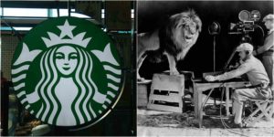
7. The original Starbucks logo would make Playboy blush, and consumers were up in arms:

The iconic green mermaid logo is unmistakable and seems to appear everywhere. It is the symbol of expensive coffee and poor spelling. But even if you’re not a fan of trends you know what Starbucks is. When it started out as a simple coffee shop, it boasted an immodest bare-naked siren with her cleavage out for all to see.
This is a stark comparison to the green which litters every corner of the globe today. That’s because the company has given in to conservatism and has ensured that every new design of the logo tastefully hides the mermaid’s assets. For good reason too, as many customers were offended when a new iteration in 2008 paying tribute to the old lady was made. The offending parts were barely visible, but that did not stop their consumers from launching a tirade against the company. Well, guess you can’t have your cake and eat it too.
6. Where did McDonald’s get its famous logo?
This has been the subject of much debate over the years. The famous franchise with its golden Ms has been debated at many a dining table.
You can’t be blamed for believing that the reason for the iconic M comes from the word McDonald’s, because the M is literally staring you in the face. But sadly, you would be wrong. The golden arches were actually designed by a man whose name started with an “M” – Stanley Meston, the original architect for the first McDonald’s restaurant.

Mr. Meston had designed the franchise’s first building and included the arches as an architectural design. The idea was to use the arches to keep rain away from the customers as they pulled up to the restaurant. They became so iconic that when re-branding started in the 60s, the golden arches became the logo. Now isn’t that a happy story?
5. Apple’s famous logo was designed so that it didn’t resemble a cherry:

Like the uniqueness of the other logos on this list, there is no mistaking the Apple logo for anything other than Steve Job’s world-leading brand. And basically, that was the point when designing the logo and choosing the name. But over the years there has been much debate about the multi-colored Apple logo as meaning something more.
Truth be told, it has no hidden meaning or agenda. The original designer of the logo, Rob Janoff, has stated multiple times that it’s just an apple. And the reason it has a bite taken out of it is because they didn’t want it to be mistaken for a cherry. So, simply put, the logo and name are for clarity and simplicity’s sake. To those who still hold that it stands for the homage to Sir Isaac Newton or Alan Turing or the fruit of knowledge, you are far from the truth. If you don’t believe us, just ask “Siri.”
4. Windows finally has a logo that looks like a window:

This has probably been a long time coming, but it took a web designer to point it out to Microsoft. Whatever issues you may have with Windows’ latest operating system, at least you won’t be mistaking their logo for a flag any more. This was the harsh criticism that a Microsoft executive received when he was told by a designer, “You call yourself Windows. But you’re a flag?” And soon a redesign of the logo, along with a bad upgrade of their operating system, followed. Well, you can’t win them all.
3. Wrestling was once called WWF, but so was a charity organization:

This is the argument put forward by many redneck fans – that wrestling was real back then. In order not to confuse themselves with those liberals who love hugging trees and saving endangered animals, it all changed to WWE. But that didn’t stop an argument ensuing between the World Wildlife Fund and the wrestling organization.
Now, we may not smell what the Rock is cooking, but we sure know this was the longest wrestling match over copyright infringement. The argument about the use of the acronym lasted well over 18 years between the two organizations; even though they settled the dispute in 1994 they continued the debate until 2012. Now, that is wrestling for you – it’s only over when someone taps out, Toptenz.net reported.
2.The Walt Disney logo is so famous that it may be fake:

You heard right, the famous Walt Disney signature is not the real deal. The signature that we have all come to know and love does not belong to the man whose name it is. This is because Walt Disney became so famous so quickly that he delegated the task of signing to his staff. There was so much fan mail and notes to sign that he could not attend to them all, so an employee or secretary was delegated the task of signing fan mail, comic strips, etc. So much so that Walt Disney himself could not match the famous signature; he had to alter his signature to try to match the style. There are currently more fakes of Walt’s signature than originals, which would be hard to identify without the use of an expert. Well, that’s not all folks…
1. The MGM lion logo was shot with a real lion, but not just one:

We saved the best for last and why not – the Metro-Goldwyn-Mayer lion is a real hero. You heard that right. The story behind this logo is what legends are made of. First, they had four real lions who gave the famous roar. The first lion was named Slats and was buried under a slab when he died because his lion soul was so super awesome they needed the slab to keep his soul in the grave.
Now that’s more badass than any war story you have ever heard. If that doesn’t give you goosebumps, how about MGM lion number two, named Jackie? This lion was so cool that he adopted a litter of kittens. More die-hard than Bruce Willis, he survived two train crashes, an earthquake, a plane crash, a boat crash, and an explosion. Now, Bear Grylls can learn something from Jackie the MGM super lion. So next time you see this lion roar you know that you are looking at the first ultimate survivor.